Most of us acknowledge that catastrophic global warming is one of the most significant existential issues ever to face our species. But we tend to talk about it in the abstract, basing our information on international research, which seems distant from our home in New Zealand. The good old Kiwi “she’ll be right” can kick in.
My own anecdotal memory is that the weather in Wellington was worse when I arrived in the early 1980s – windier, colder, more rain … I even remember joking with my flatmates in 1984, “roll on global warming – it will make Wellington a more pleasant place to live”. Shame on us.
But how has the climate really changed locally?
In the age of generative AI, it’s a surprisingly easy question to answer, ironically noting that answering such questions with energy-guzzling compute makes asking the question part of the problem. And the accuracy of such answers requires verification.
For the princely sum of £7, I downloaded a data series from openweathermap.org of hourly weather observations from 1979 to the present for Wellington, and fed this into Google’s Gemini AI, and proceeded to ask a bunch of questions. You can read the full conversation with Gemini (and even continue to ask it more questions about the data set), but here are my main take-outs:
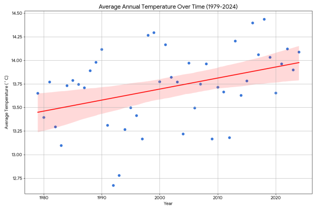
Wellington has become warmer since 1979, by an average of 0.5°C.

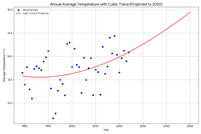
I asked Gemini to do a cubic regression and project the temperature trend out to 2050. Bad news, it looks like a 1.5°C rise from 1979. But perhaps a cubic regression is not the best tool for this. Colour me scared in any case.

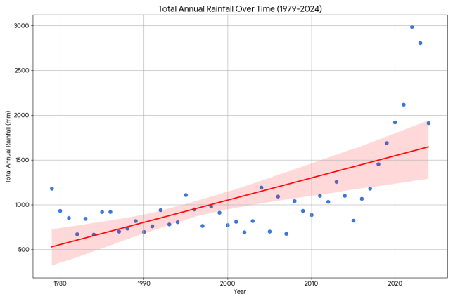
Wellington has become much wetter. The top ten wettest days, weeks, and months have all been in the 2020s.

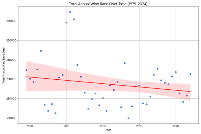
Wind is interesting. Although almost all of the top ten windiest days (as measured by daily wind race) have been in the 2020s, overall we’ve had less wind over the course of a year, and half of the least windy calendar months have been in the 2020s.

You might have your own questions you’re curious to ask. You can do this by accessing the full conversation with Gemini and simply asking away.
So yes, our climate seems to be changing. And we have powerful tools at our disposal now that are really easy to use, to allow anyone to do a deep dive into the data.
Important caveat: I have verified neither the data provided by openweathermap nor the code generated by Gemini. This analysis was performed completely independently of MetService, who had no input nor review. Please consider this analysis to be anecdotal. Your mileage may vary. All feedback welcome.
How has the climate changed in your locality? If you’re doing a similar analysis, please let us know by posting a link in the comments below.

Very interesting, I didn’t know you could see the Python that it generates.
Looks like it chokes on parsing this date “1979-01-01 00:00:00 +0000 UTC” quite often…
OMG the sunniest Wellington has ever been since 1979 was a period of 88 hours! No wonder we all wear black.
Thanks, Dave
I’ve been in Wellington since 1963. For the first forty or so years, we had regular nasty southerlies that lasted 5 days. Not so now.